Branding
How Spica Found Its Face
Here is the messy, winding, and accidentally perfect journey of how we found the perfect logo to represent ourselves.

Thiru N
Dec 31, 2025

Spica is named after the brightest star in the Virgo constellation. That’s the easy part. Knowing who you are is one thing. Figuring out what that looks like on a screen is a whole different beast. We didn’t wake up with this logo, and we’re very grateful for that. We spent months chasing our tails, and boy, was it a ride. We went from “furniture store” to “confusing typo” before the universe basically threw the answer at us.
This is the messy, winding, and accidentally perfect journey of how we found our face.
Phase 1: The “Furniture Store” Era
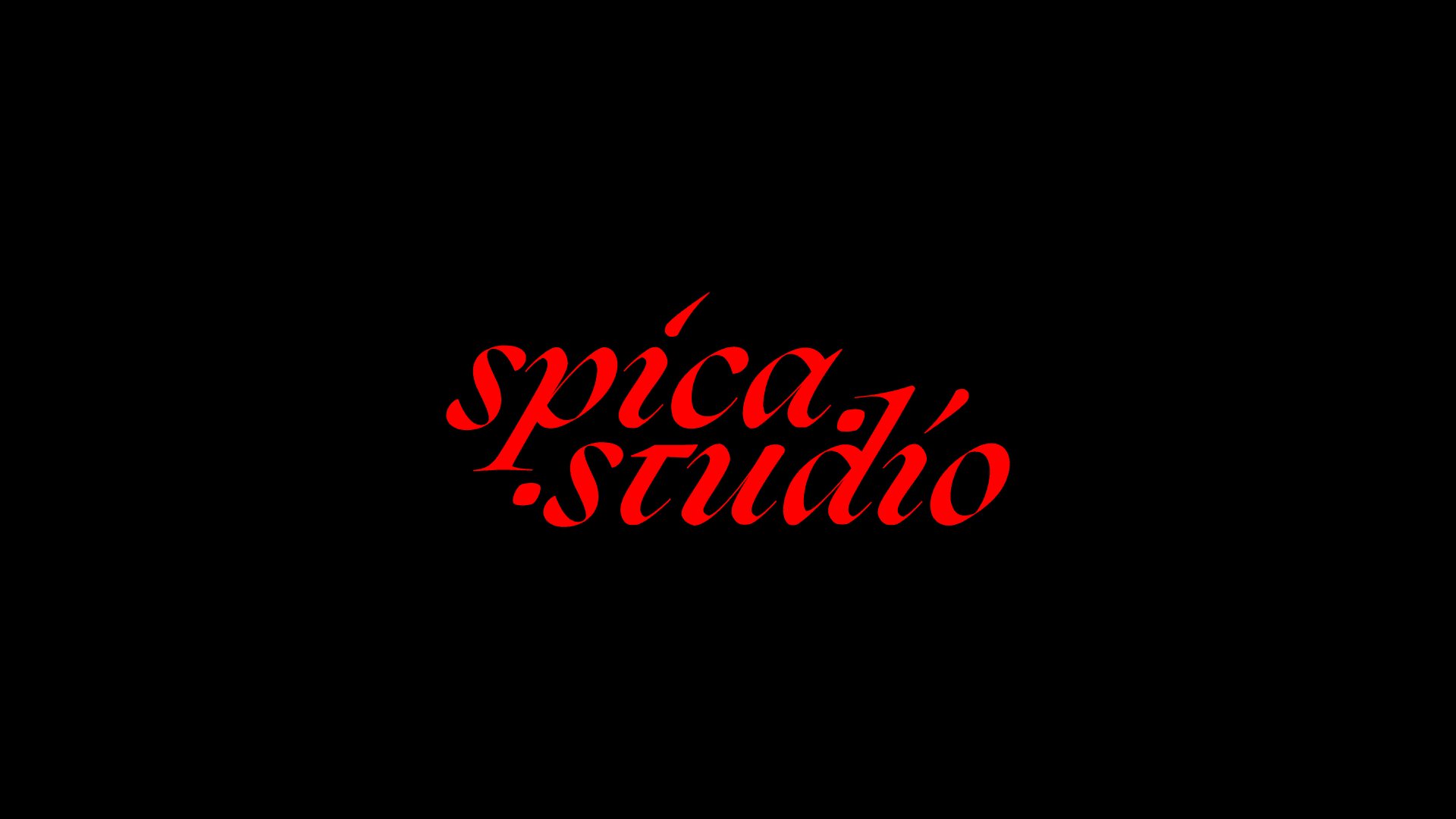
We were gearing up to register our business, and we wanted a logo. It had to be good. After all, we do this for a living, and we didn’t want anything half-baked. We started with a chip on our shoulder. We looked at the design landscape. Minimal, clean, invisible. And we said, “No.” We wanted to be loud. We wanted to be distinct. So we overcorrected. Hard. Really hard. We made a heavy, red, intricate block of a logo. We shoved the URL into it. We added brackets. We tried to make it look architectural. We sat back and looked at it, and, well, it didn’t look like a design studio. It looked like a company that sells high-end office chairs. It was busy. It was noisy. A classic case of trying too hard.
Phase 2: The Blinking “S”
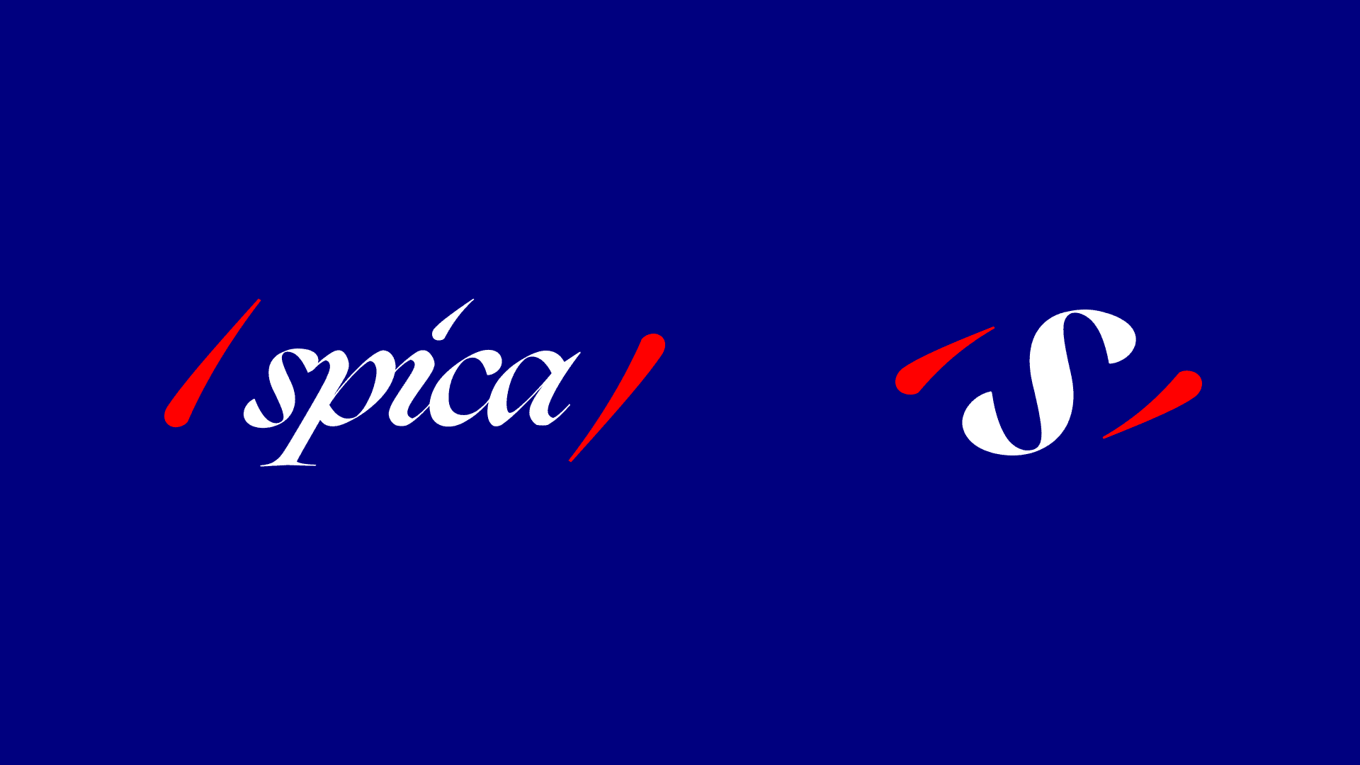
We scrapped it. We realized that unless we only exist in a browser bar, we don’t need “.studio” in our name. We stripped it down to just Spica. Then we got experimental. We tried turning the letter “S” into an eye. We spent days animating it, making it blink, squint, and look around. The concept was cool, a logo that watches you back, but the execution felt forced. We were trying to make the logo act smart before it actually looked smart.
Phase 3: The “Spoca” Problem
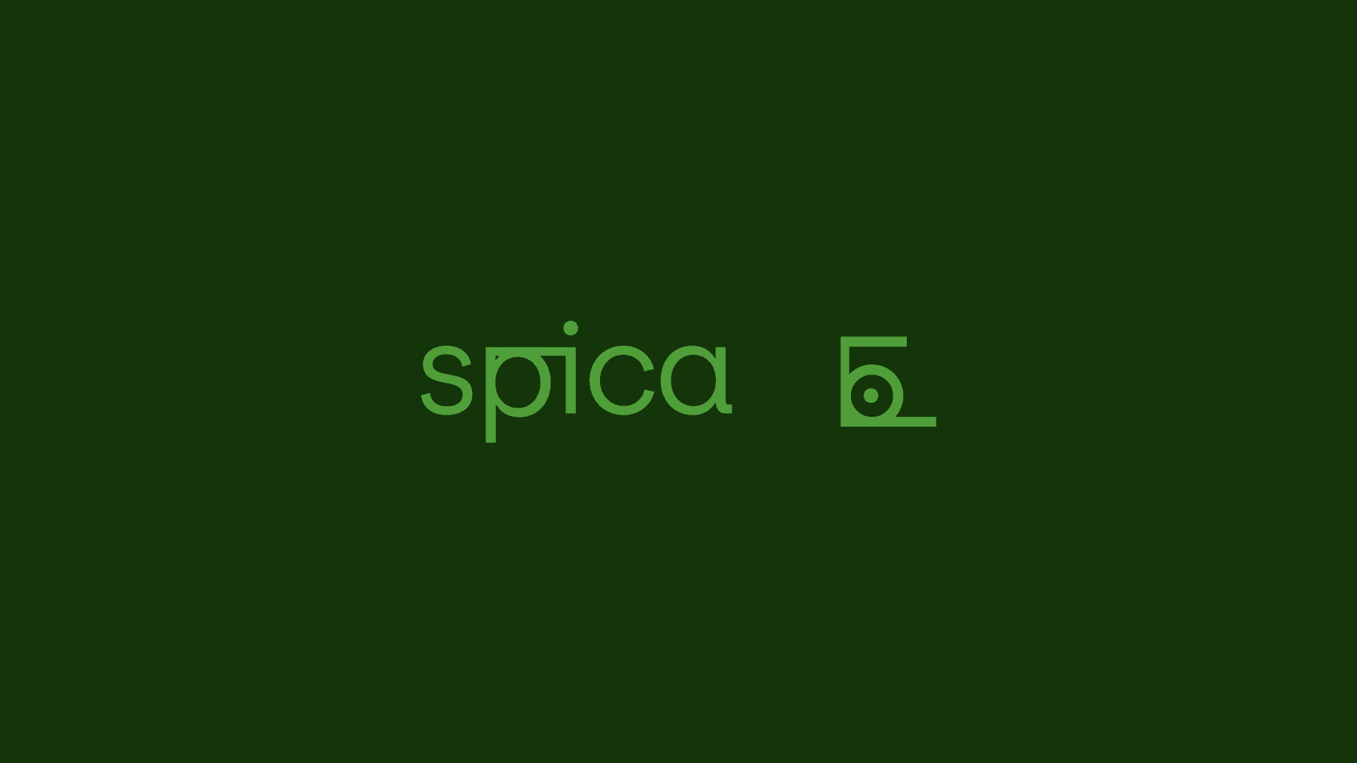
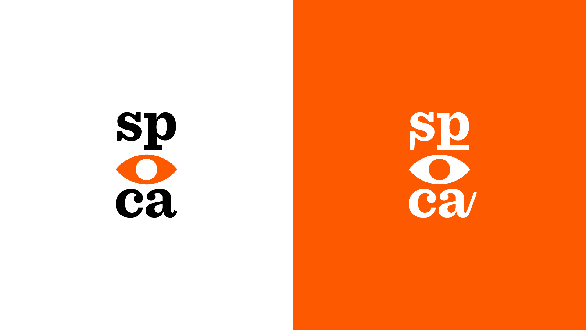
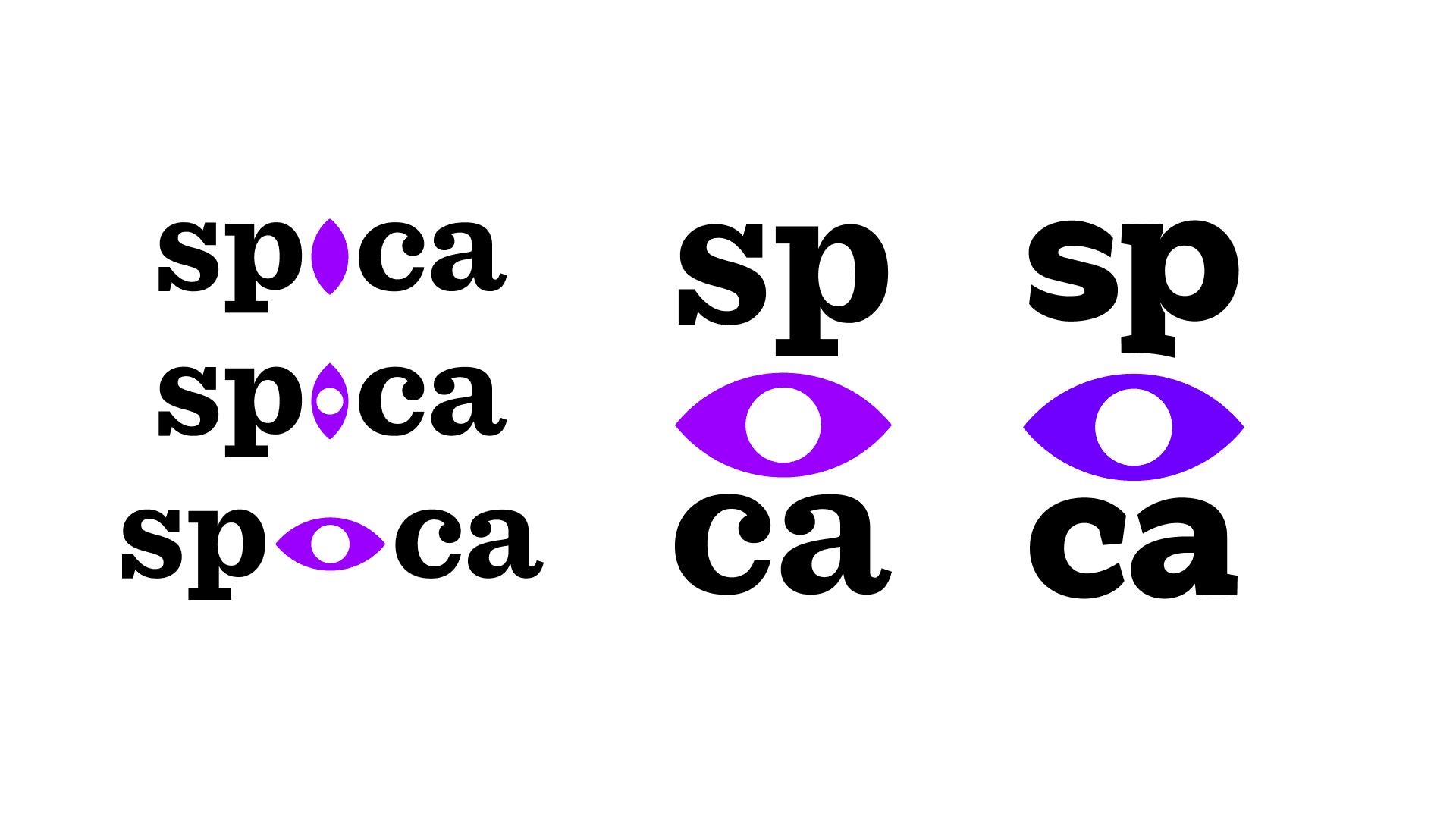
That’s when we found the vertical stack. SP on top, CA on the bottom, with an eye bridging the gap. It was cleaner. It was smarter. But we made one lazy choice. We gave the eye a standard, circular pupil. It looked fine, but visually, it was a disaster. When you put a circle between letters, the brain reads it as an “O.” We weren’t Spica anymore. To half the people seeing it, we were Spoca. It was frustrating. It was 90 percent there, but it had no soul.
Phase 4: The Bike Ride Epiphany
The breakthrough didn’t happen in Adobe Illustrator. It happened on the back of a bike, weaving through Bangalore traffic. Our minds were wandering, just staring at the road, when the two halves of the brand slammed together. Our name is a star. Our symbol is an eye. Why were we treating them like two different things? It hit us like a truck, thankfully not in real life. The pupil shouldn’t look at the star. The pupil should be the star. We rushed back and swapped that generic circle for a four-pointed glimmer. Immediately, the Spoca problem vanished. The eye wasn’t just watching anymore. It was shining.
But that was only the first domino.
Phase 5: The Eldritch Truth
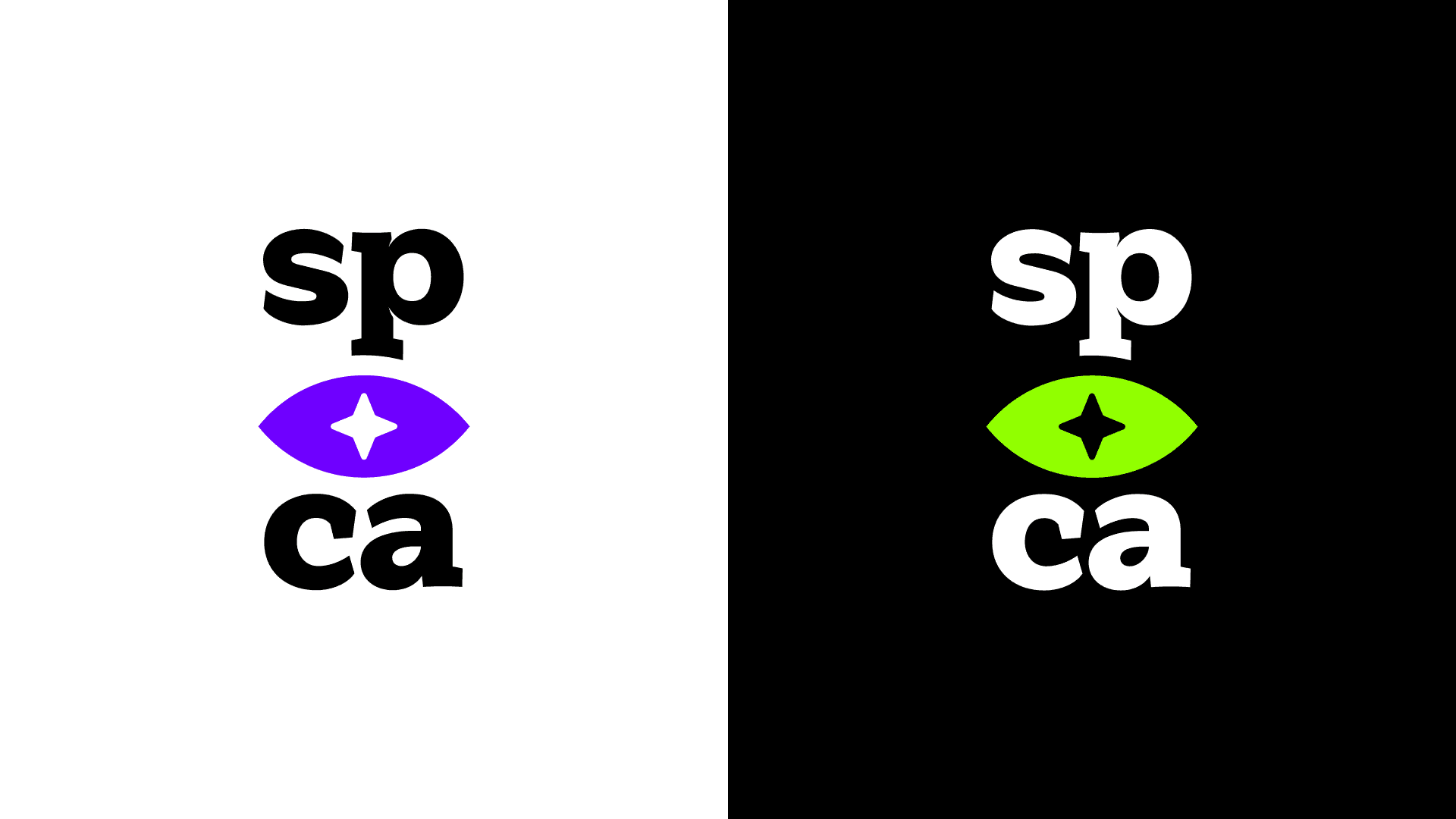
Why a star pupil? Sure, the name is Spica. But let’s be real. We’re huge cosmic horror fans. We love the eldritch, the idea of vast, unknowable things watching from the deep. A round pupil is human. It’s safe. A star-shaped pupil is something else. It gave the logo that specific, slightly unearthly vibe we love. A little bit of the Void looking back at you.
Phase 6: The Math & the Magic (AKA the Crazy Part)
Here’s where it gets weird. Like winning-the-lottery weird. Let’s talk color. We’re obsessed with green. So we chose that radioactive, Y2K neon green for our logo. For a few days, our brand was Neon Green on Black. It felt edgy. It felt right. But you can’t live in Dark Mode forever. We needed a light theme. We didn’t pick a color from a book. We let math do it. We took our neon green hex code and mathematically inverted it. Black became white, and that sharp acid green flipped into a deep, electric purple. We looked at the purple. It looked cool. Then we Googled it. That exact shade of purple is the color of the Ajna Chakra, the Third Eye.
We didn’t plan this. We literally inverted the math of our favorite color, and it landed perfectly on an ancient symbol of perception.
The Final Alignment
But wait. It gets better. We started reading about the Third Eye. It’s not just about seeing. It’s said to connect people to intuition, to help them communicate with the world, and to receive messages from the past and the future. Think about that. Intuition. Communication. Future. That’s basically our entire job. It felt like reading winning lottery numbers, digit by digit. We started with a furniture-store logo and ended with a symbol that perfectly described our philosophy, backed by math, mythology, and a little bit of cosmic horror.
Spica Today
That moment of alignment was four years ago. We haven’t touched the design since. Why mess with destiny?
Today, we just have fun with it. On our site, the eye breathes. It looks around. It even blinks “S-E-E” in Morse code if you stare at it long enough, wink wink. We took the long, messy road to get here, but looking back, we wouldn’t change a single wrong turn.
If there’s a lesson in all this, it’s to let ideas simmer and wait for that aha moment. We’re still chasing that high four years later, and it remains one of our biggest driving forces.
